4 Visualization
To better understand the dataset, it is better to visualize it. We want to see if there are clear differences between tones, speakers, and repetitions. Depending on the number of tokens, this kind of visualization may not be practical. With 220 observations, we can plot the dataset, but note that at this level, the visualization looks crowded already.
Note that we:
- Use seconds to make the x-axis labels more compact
- Color-code the traces by repetition
- Group the traces by token
- Plot speakers in rows and Tones in columns
p <- ggplot(
  f0_df,
  aes(
    x = t_ms / 1000,
    y = F0,
    color = repetition, linetype = repetition,
    group = token
  )) +
  geom_line(alpha = 0.7, linewidth = 0.5) +
  facet_grid(
    rows = vars(Speaker),
    cols = vars(Tone),
    as.table = TRUE, switch = "y") +
  labs(title = NULL, x = "Time/s", y = "F0/Hz") +
  scale_y_continuous(n.breaks = 3) +
  guides(color = guide_legend(position = "bottom")) +
  theme_minimal(base_size = 18) +
  theme(
    axis.text.x = element_text(angle = 90, hjust = 1))
p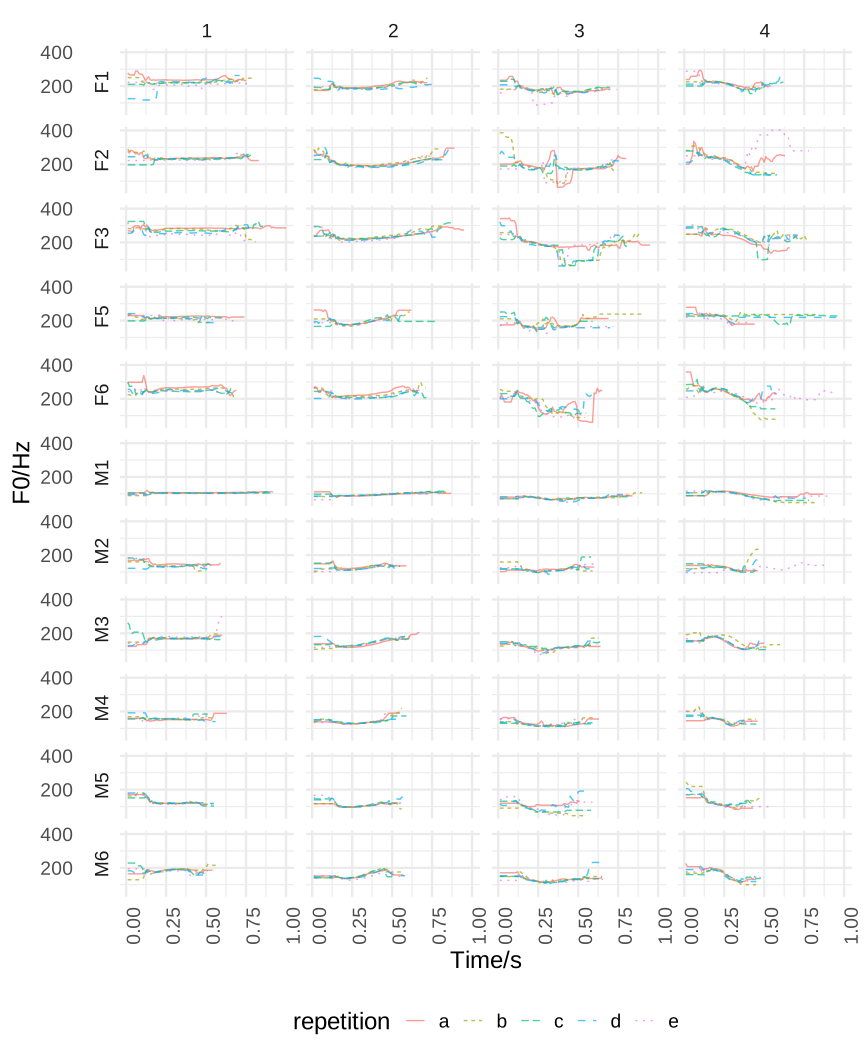
In this plot, we can see that
- The duration of the tokens differs within and between participants
- Overall F0 is different for male and female speakers (as expected)
- The tone realization also differs, mostly between speakers
- Unnatural F0 jumps (especially in Tone 3 produced by female speakers)